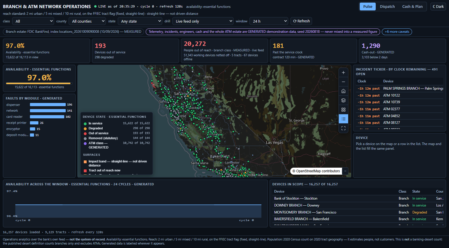
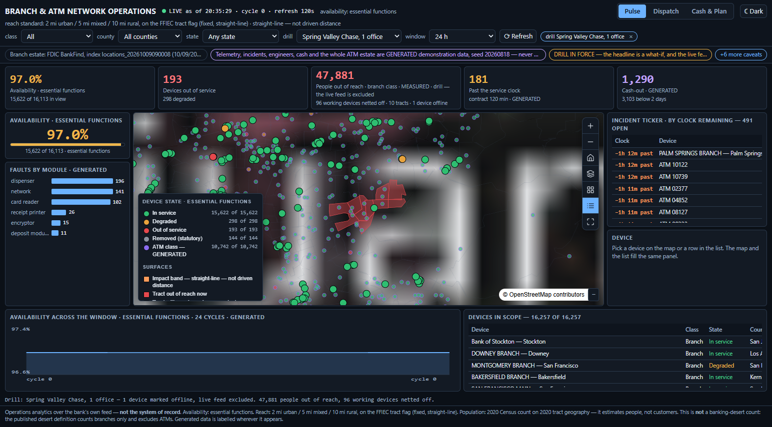
Every fault console knows a machine is down. None of them knows who is stranded by it. This one does — and it prints the subtraction that makes the figure honest: how many working devices were netted off before the headline was written.
That decision is made many times a day by one desk, against a service clock that is a contract rather than a rule. It is made today on a device list that knows the machine is down and knows nothing about the people it served.
So the app ranks the estate by who is cut off, not by how many pins are red. Two failures with identical fault codes are not the same incident: one strands nobody, because every tract around it keeps an alternative inside the same band; the other is the only cash access forty-seven thousand people have.
Not a compliance product. Nothing here is aimed at a risk, credit, ESG or CRA function — availability is the buyer's number, engineer visits are their cost, and the customer at a dead machine is their exposure.
1,486,347 people across 351 tracts depend on exactly one office. The largest single one holds 47,881.
Measured from the published federal branch register and the published tract population — not from telemetry. Only which device is offline at this second is generated.
Excellent fault systems with a pin map bolted on. The map renders the device list; it never asks who lives around the device. The nearest thing to an impact figure counts failed transactions at the machine — by construction, only people already standing in front of it.
Site selection, trade areas, consolidation modelling. One public dashboard performs this app's exact tract-and-radius arithmetic — annually, on branches only, with ATMs explicitly excluded, and only for permanent presence.
An outage management system fuses SCADA, GIS and the customer register to report the number of customers impacted and to prioritise restoration. That is the shape. This is the banking version of that instrument.
One jurisdiction has already made reachable-population-after-a-closure a regulated calculation — the UK, on a twelve-week clock, for announced or sustained changes. Nobody, anywhere, computes it for a machine that failed at 06:40 this morning.
| Category | What the product pages actually claim | Cadence | Turns an outage into people? |
|---|---|---|---|
| ATM / self-service consoles | availability, fault diagnosis, remote fix, dispatch — and a street-level state-of-health map | real time | No — status pins only |
| Transaction observability | in-flight capture at every network hop; failure and slowdown diagnosis in milliseconds | real time | No map at all |
| Location intelligence for banking | site selection, trade areas, whitespace, branch consolidation and relocation modelling | strategic | No — a planned network |
| The published desert dashboard | the identical tract-and-radius arithmetic on 2 / 5 / 10-mile bands | annual, branches only | Yes — but never for a failure |
| The UK cash-access regime | percentage of people within 1 mi urban / 3 mi rural of the remaining services; remedies inside 3 months | 12 weeks | Yes — and not in the US |
| This application | people out of reach right now, per incident, net of working same-class devices in the same band | the refresh cycle | Yes — for a device that failed this morning |
The sharpest finding of the study fits in one sentence: the systems that know the machine is down cannot draw the population, and the systems that can draw the population run once a year over a network nobody has broken yet.
The real incumbent, as always, is a spreadsheet assembled after the fact — which is the wrong artefact for a one-hour decision.
Three incompatible conventions with three different expectations — network (99 %+), any-function (98–99 %), essential functions (96–98 %). A bare "97.4 %" on a wallboard is not defensible. Every availability figure here carries the convention that produced it, on screen and in every export.
A branch closing needs 90 days' notice to the agency and to customers. So removed and planned-closure are first-class device states carrying a statutory date — and are never counted as an outage. 144 measured statutory removals ship as their own class.
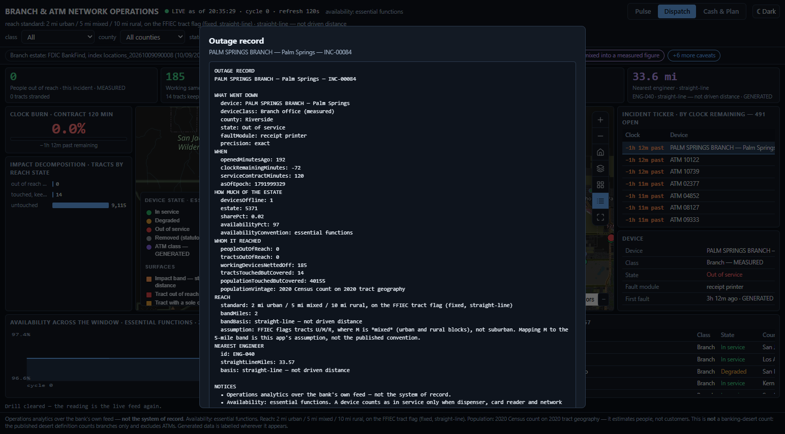
A notification incident that materially disrupts operations must reach the primary federal regulator within 36 hours. A switch or vendor failure taking out a region is squarely in scope. So the outage record has to be evidence-grade, not a wallboard that repaints and forgets.
Colour is never the only channel. Every state is carried by colour and marker size and a legend row naming it in words, and every popup prints the state as text — because the style compiler renders every marker as a circle, so shape cannot carry meaning here.
For every device offline at this moment: the population of the tracts whose only cash-access point of that class inside the published band is that device, minus every working same-class device inside the same band. Recomputed on the refresh cycle, attributed per incident, summable across an area outage.
The subtraction is the integrity of the number. Without it, this is a population map with an outage painted over it. So the count of devices netted off sits beside the headline, always — a design that reported people inside the band of an offline device would have printed 157,019 for the first row below and roughly 33 million for the last. Both would be wrong.
Choosing a drill once moved the headline to another county and left the map where it was — so the consequence the number described was off screen. The map now fits to the drill's devices and to the tracts they strand.
A wallboard repaints and forgets. The federal notification rule does not: what went down, when, for how long, over how much of the estate — and whom it reached. That last column is the one no fault console can produce, and it is why this artefact is worth more than the dispatch it sits beside.
The browser suite repaints nine live surfaces in both themes into a 1×1 canvas over the ancestor stack actually composited behind them. Parsing a computed colour string is wrong the moment a colour is computed — and a contrast check that is itself wrong is worse than none.
The same arithmetic under a county-level metro classifier gives 3,568,904 people beyond the band against 1,149,470. Both are defensible readings of one published convention. The app fixes one, prints it, and offers no control that changes it — a desk that could move the standard could move its own impact number.
Its step B.3 could not be followed: none of the 152 year-over-year removals remains in the current register. They ship instead as a separate measured removed class from their own source, never counted as an outage. The alternative was to invent a state the data cannot support.
Reading the figures: the branch estate, the census geography and the population are real, published and probed. Device status, uptime, module faults, cash levels, engineer positions and the entire ATM class are GENERATED (seed 20260818) — there is no public register of US bank ATMs — and are labelled as such on every screen, in every popup and in every export.
And one more, said plainly: California is where the data is verifiable. It is not where the buyer is. Reading a Californian figure here as a statement about another estate is a misreading — and the app is built to be hard to misread that way.
Your estate with coordinates and device class, your status feed, your service-contract clock, and a population layer for your market. Two weeks, and this board reads your network instead of a generated one.
Swappable by configuration, not by code: the reporting geography, the population source, the band convention and the availability definition. No distance, label, currency or threshold is hardcoded to a US rule — the reach arithmetic is a method the app renders, not a list of US numbers it ships.