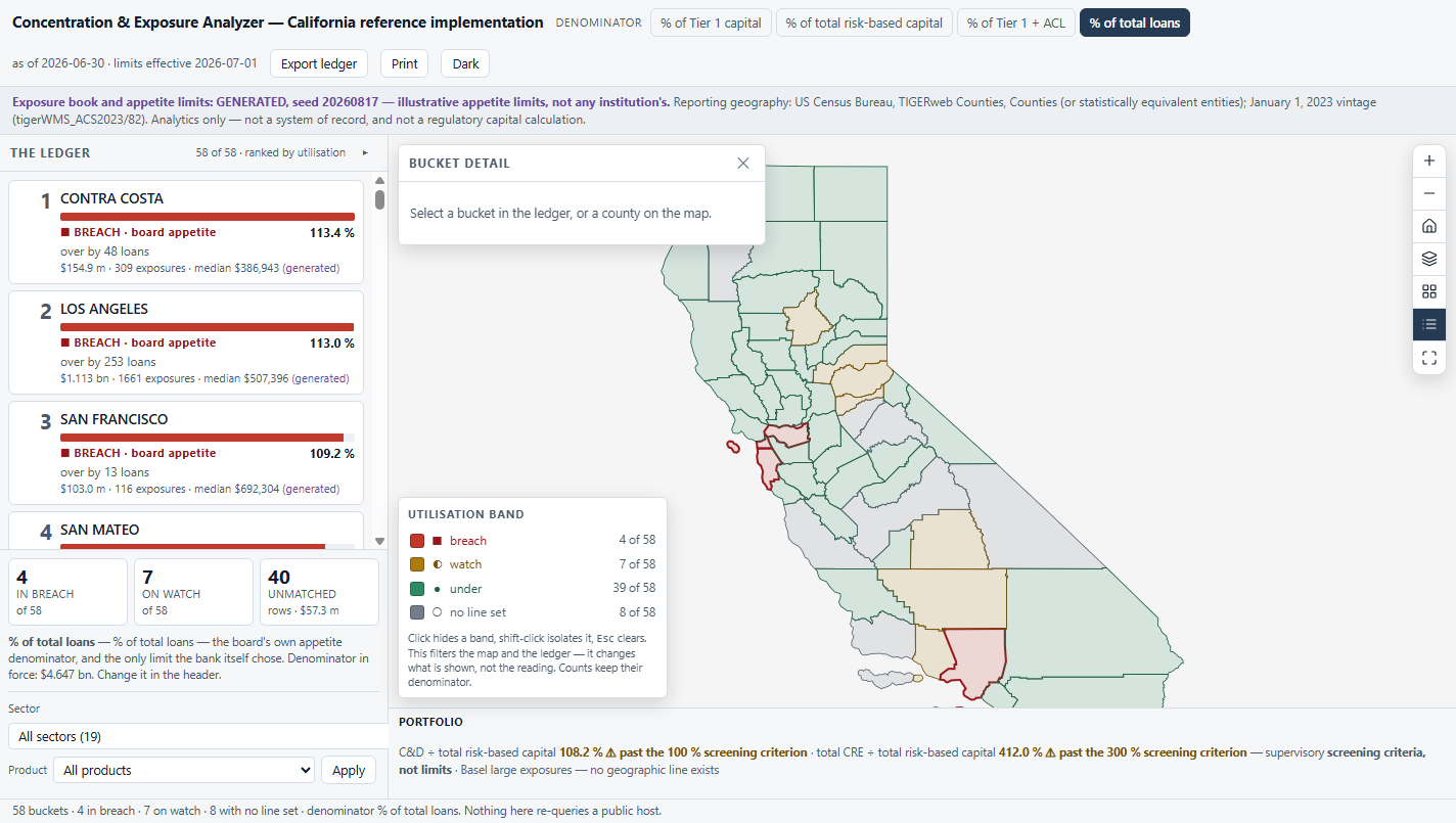
Exposure buckets ranked by utilisation of the line that binds — breaches pinned to the top — beside a hero map that answers back. And the number nobody else reports: how much new business still fits before the line is crossed.
Approve it, price it up, push it to a different geography or sector, or stop. That decision is made weekly by a portfolio manager and ratified quarterly by a board risk committee. It is not a disclosure exercise and it is not a hazard question.
Which is why the app is ranked by utilisation of the binding line, never by size. The largest bucket is almost never the problem; the one at 96 % of its line is. Sorting by exposure puts the same county at the top of every reading ever taken and tells a portfolio manager nothing they did not already know.
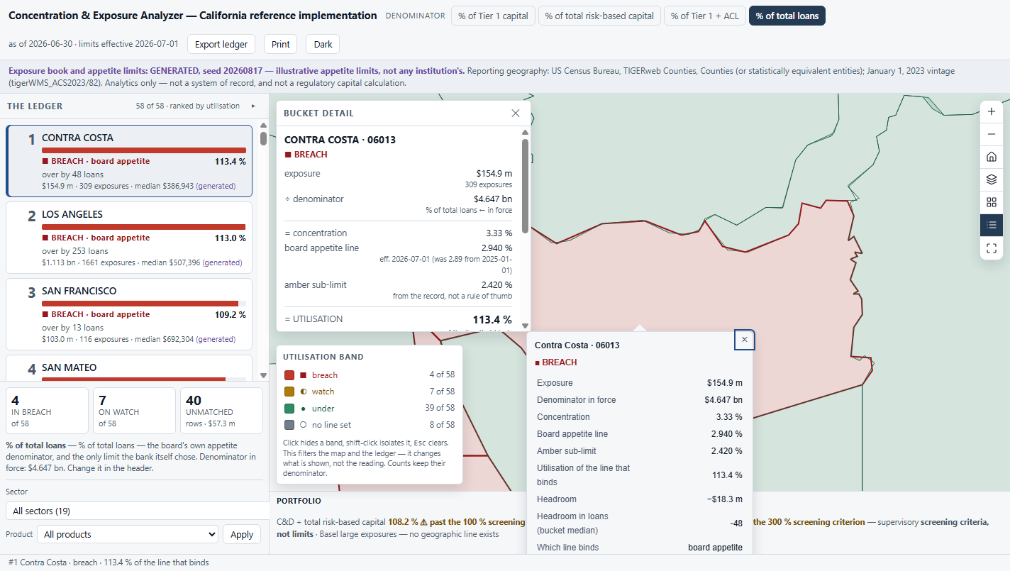
Rank 1 holds $154.9 m and sits at 113.4 % of its board appetite line — over by 48 loans at that bucket's own median size.
Under a different denominator and a construction-and-land scope, rank 1 holds $53.7 m. Size never leads.
The Basel LEX standard — reportable at 10 % of Tier 1, hard-limited at 25 % — governs one counterparty or a group of connected counterparties. Geography and sector are explicitly outside it.
Concentration by geography, sector or product is assessed through the bank's own ICAAP and its supervisor's review — the risks not fully captured by charges that assume a diversified portfolio.
The binding line is one the bank wrote for itself and must defend. An argued number needs different things on screen than a looked-up one — which is the entire design brief.
The published brief named the standard as Basel geographic concentration. Correcting it did not invalidate the solution — it sharpened it.
| Regime | Denominator | The number | Is it a limit? |
|---|---|---|---|
| Basel large exposures (LEX) | Tier 1 capital | reportable ≥ 10 %; hard limit 25 % | Yes — but counterparty-only |
| US interagency CRE guidance (2006) | Total risk-based capital | C&D ≥ 100 %; total CRE ≥ 300 % | No — a screening criterion |
| OCC Concentrations of Credit (2020) | Tier 1 capital plus the ACL | no threshold at all | No — a measurement convention |
| The board's own appetite statement | often % of total loans — not capital at all | whatever the board wrote, with an amber sub-limit under the red one | Yes — the only limit the bank chose |
The same bucket of the same book is legitimately 18 %, 24 % or 31 % depending only on which rule you divided by. A utilisation figure quoted without its denominator is not checkable, and a breach claimed without one is not defensible to an examiner.
So one named denominator is in force at a time, chosen in the header, printed beside every number and carried into every export. It is provenance, not navigation — the app never stages a debate about which reading is correct.
On the card, per bucket. The only line written at bucket grain and the only limit the bank itself chose. The rank is computed on it, and the card names it as the binding line in words — never by colour alone.
In the portfolio strip. C&D and total CRE against total risk-based capital, past the 100 % and 300 % criteria. Portfolio-level ratios: drawing one on a county would invent it.
A named absence. The strip reads "Basel large exposures — no geographic line exists", because the published brief invites the reader to expect one. Stated, rather than omitted.
Band edges come from the appetite record, never from a rule of thumb — each line carries its own amber sub-limit as a field. And no line set is never green: a bucket the board never wrote a line for is an unanswered question, not a compliant one. Every band pairs a colour with a glyph and a word.
Not "utilisation 113 %", and not "$17 m of remaining limit", but the number of loans of this bucket's own median size that still fit — attached to the named line that binds and the named denominator that produced it.
Two ratios, both printed, never conflated. Concentration is exposure ÷ the denominator; utilisation is concentration ÷ the line. Every term is derived — change the denominator and the band, the rank order, both headroom figures, the KPIs and the legend counts all move in one frame, because they are one expression.
The outbound half — row to map — is what every viewer in this shape ships. The inbound half is the one they skip, and without it the map is a picture rather than a partner.
With every public host blocked, the app boots, ranks all 58, paints, switches denominator and exports — and asks for nothing that was blocked. Asserted from the browser's own network log, not from reading the code.
Switch to % of total risk-based capital on a construction-and-land scope and the rank reorders completely: a different county leads at 132.8 %, and the counts move to 2 in breach, 9 on watch, 14 with no line set.
Unmatched rows are reported, never dropped. The published anchor says 1.21 % of California lending by amount belongs to no county — and averages 2.66× the matched mean, a skew the app states rather than smooths.
Reading the figures: the reporting geography and the industry classification are real, published and probed. The exposure book, the balance sheet and the appetite limits are GENERATED (seed 20260817) and illustrative — not any institution's — and labelled as such on every screen, in every popup and in every export.
Every one of these is written into the delivered application's own README. A tool that hides its edges costs you the project it cannot finish.
Your exposure book at bucket grain, your appetite statement with its amber sub-limits and effective dates, your balance-sheet figures for the denominators, and an owner for your sector mapping. Two weeks, and this ledger reads your portfolio instead of a generated one.
Swappable by configuration, not by code: the reporting geography and the industry code list. No threshold, label, currency or denominator is hardcoded to a US rule — the three kinds of line are a typology the app renders, not a list of US numbers it ships.