Where you worked.
And what moved.
One published, measured indicator, changed between two vintages its own publisher calls comparable — read across the places an organisation worked, beside the same change where it did not. The comparison rule is named on screen, and the causal claim is withheld in writing.
Renew the grant. Sign off the annual report.
The reader is a funder or a board, reached through a programme officer, and the tempo is annual and retrospective. The app produces the evidence section of a document somebody is already obliged to write — and there are four, each with its own clock.
- The Form 990 statement of program service accomplishments — every 501(c)(3), yearly.
- The community benefits plan a Californian non-profit hospital adopts, files with the state and posts every year (H&SC §§ 127340–127360; AB 204, 2019).
- The CHNA report, triennially, which must contain an evaluation of the impact of the actions taken since the last one (26 CFR § 1.501(r)-3).
- The federal performance report — accomplishments against objectives, and why goals were not met (2 CFR § 200.329).
None of the four asks for a causal estimate. All four ask for the same thing this app produces: what happened, where, beside what else was happening.
Against the rest of California the differential is +337.1. Against counties that started in the footprint's own band it is +378.9. Against the other worst-quartile child-poverty counties — a set of two — it is +15.5.
Same measure, same two vintages, same twelve counties. A differential quoted without its rule is not checkable.
The obvious data source forbids this use — in its publisher's own words.
Modelled, and it says so
PLACES is multilevel regression and post-stratification over BRFSS. Sub-county estimates rest on a fixed decennial post-stratification, and the model “does not consider any local policy or intervention effects” — by construction it cannot show one.
The releases are not a series
Measured, not assumed: no year field in the feature service · six releases that overlap by a data year · 21 of 44 measures absent from at least one · California's tract universe moving 8,005 → 9,070, where a GEOID join succeeds for 6,826 and is wrong.
And silence is not permission
The vulnerability index is no better: its values are percentile ranks relative to the tracts being compared — a position in one year's field, not a level — and its FAQ, read in full, says nothing at all about comparing across years.
So the change lane moved off the modelled measures onto a counted one whose publisher declares its own comparability in a column. The honest set is smaller, coarser and countable — which is the stronger position.
Both halves are public. Nobody joins them.
The camp that holds the footprint has no measures
- UpMetrics manages “the complete impact reporting lifecycle” over metrics grantees submit — no mapping, no geographic analysis, benchmarked inside one portfolio.
- Sopact and ImpactMapper are participant- and evidence-anchored: outcomes on one ID. Neither is place-anchored.
- Clear Impact Scorecard publishes the right object — an indicator with a baseline and a turn-the-curve narrative — per indicator, for a jurisdiction. Never split by where an organisation worked.
- ArcGIS StoryMaps owns this app's silhouette and nothing else: sidecar blocks over the organisation's own data. It draws where, never whether.
- Candid Foundation Maps — 3 m+ grants, 38,000 foundations — maps the money, at genuinely high fidelity. It never asks what moved.
The camp that holds the measures has no footprint
- SparkMap is the closest existing thing: 390+ benchmarked indicators, a Draw-My-Area tool, one-click report — a needs assessment for one area at one time, with no period comparison documented.
- PolicyMap puts indicators at tract and ZIP for CHNAs and documents no comparison methodology and no trend feature. It makes no impact claim, correctly.
- County Health Rankings is the one free tool publishing measured trends — county-only, 15 measures, regressions at 80 % confidence, with the state and national line as the only comparison offered.
- The publishers' own atlases render levels for everybody. None of them knows an organisation exists.
- Maptitude for Health Care does territory and drive time on the desktop from US$795 — no temporal analysis at all.
And the sector's dominant public rating of impact has no place in it at all: across a 61-page March 2026 methodology guide, “geograph” appears once; “county” and “ZIP”, not at all. Its data-quality metric scores an outright guess at 0.6.
Three rules. Three answers. One measure, two vintages, twelve counties.
| The rule, as named on screen | Comparison set | Its change | Footprint change | The differential move |
|---|---|---|---|---|
| A · The rest of California | 46 counties — every one the organisation did not work in | +690.8 | +1,027.9 | +337.1 |
| B · Same 2013–2015 band | 14 counties inside the footprint's own starting range, 6,592–11,667 | +649.0 | +1,027.9 | +378.9 |
| C · Other worst-quartile child-poverty counties | 2 — Imperial and Glenn: the rest of the pool the footprint was drawn from | +1,012.4 | +1,027.9 | +15.5 |
A twenty-two-fold swing from changing nothing but the comparison. That is the product, not a weakness. A comparison set assembled to flatter is the one failure this application could not survive, and the defence against it is that the rule is always visible.
So the rule is named, its membership is listed by county, its n sits on the face of every reading it produces, and it rides in the URL — a quoted number cannot travel without the rule that made it. Choosing C raises a warning naming the two-county set, once, at the moment of choosing.
Three things stand in the way — and all three are on the page.
Organisations choose where they work
And they choose where need is worst. The worked set therefore starts further from the mean and drifts back toward it whether or not anyone does anything. The app never treats a footprint as though it had been assigned at random.
The two sets were already diverging
A difference between two changes means something only if the sets were moving together first. Here they were not: the pre-period differential is +69.5, and the gap widened from +1,277.4 in 1997–1999 to +1,891.7 in 2013–2015. All 24 spans are drawn.
The framework withholds the credit
Results-Based Accountability, the published standard this is measured against, says it outright: a single programme, agency or service system cannot take sole responsibility — or credit — for a population result. That sentence sits in the notice bar and in every export.
Both directions are rendered, and a flat line is a finding. One footprint county improved — Lake, at −108.1 — and it is drawn as an improvement. Both sets got worse overall, which is what the published series records, not evidence that anybody's programme harmed anybody. Every state pairs a colour with a hatch and a spelled-out word, so the reading survives a greyscale print.
A page a board reads, not a console an operator drives.
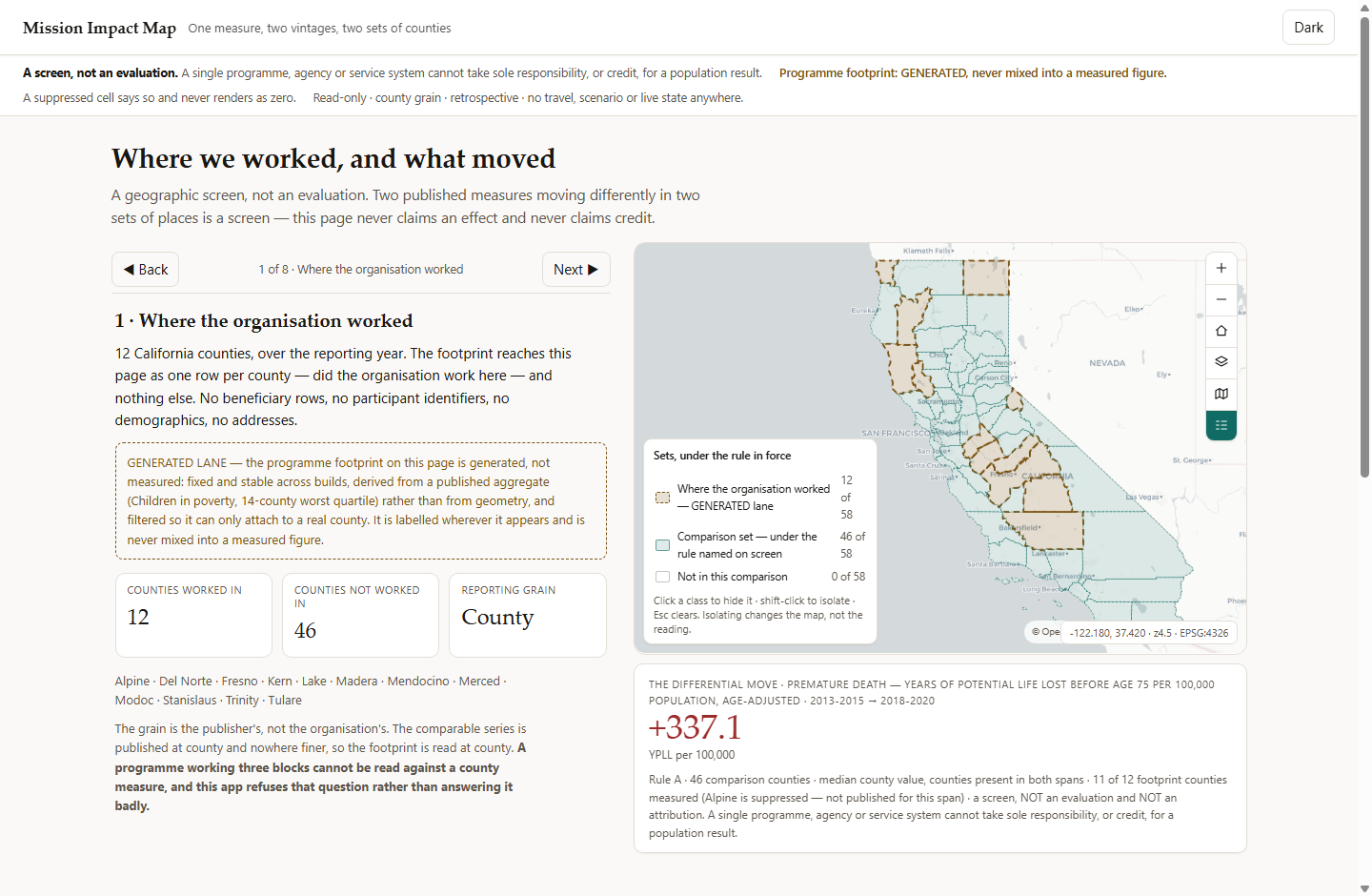
- A scroll story over a pinned map stage. Eight sections in a written order — the footprint, then the comparison rule, then the pre-period, then the difference, then the limits. Any other order lets a reader take the number without the caveat.
- The notice bar never clears. The screen-not-an-evaluation rule, the withheld credit, the GENERATED lane, the suppression rule. The status line beneath it is transient; nothing lasting is trusted to it.
- Every legend class keeps its denominator — 12 of 58 — and a class click filters the layer rather than fading it.
- The reading card carries its whole basis: the rule, its n, the measure, both vintages, 11 of 12 footprint counties measured, and the withheld causal claim — in one string that travels into every export.
- Read at county, and it says so. A programme working three blocks cannot be read against a county measure, and the app refuses that question on screen rather than answering it badly.
A difference between two observed changes.
Not an effect, not an impact, not a return on anything. One published measured indicator — premature death, years of potential life lost before 75 per 100,000, age-adjusted — between two vintages the publisher itself flags as comparable, across two named sets of counties.
comparison 5,700.9 → 6,391.7 = change +690.8 · n = 46
= THE DIFFERENTIAL MOVE +337.1 YPLL per 100,000
the pre-period, same arithmetic: −38.1 against −107.6 = +69.5
Median county value, balanced panel — a county counts only where both spans are published. Alpine is not published for 2013–2015, so it is named and excluded rather than counted as zero. Trinity moved +3,902.7 on a population of 3,600; the median is why that is not the headline.
Nothing on the page is printed from a constant. The reading, the memberships and every count are recomputed from the layers — which is how a rounding decision that moved the headline by 0.1 was caught by the suite rather than by a reader.
the default, and the widest reading the data supports
counties that started where the footprint started, 6,592–11,667
and the app says so: a differential against two counties is not the same object as one against forty-six
Change the rule, and watch the headline move.
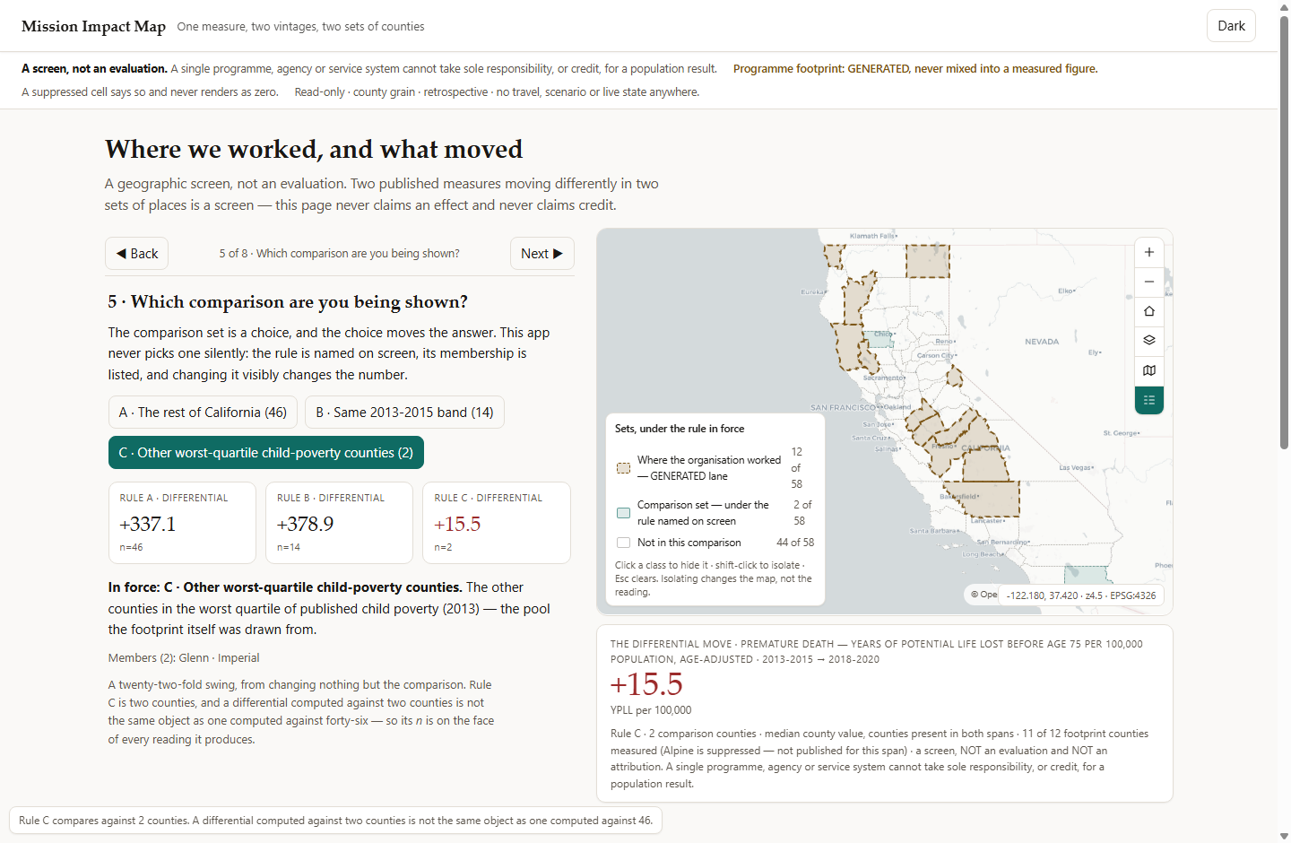
The app hands the reader the thing that would embarrass it. A product that hid the rule would read better and be worth less.
- Master–detail is bidirectional. A table row adopts its county — fly, popup, marked row, filled detail pane; a map click marks the row. The same row again releases.
- The legend filters, and counts. Click hides a class, shift-click isolates, Esc unwinds one thing at a time.
- Section and rule ride in the URL, and a deep link round-trips section, rule and county through a cold load.
- Export CSV and GeoJSON carry a preamble with both claims and the provenance; Compose the annual-report section prints the argument with the chrome dropped and the footer kept.
Built, driven and measured — 2026-08-25.
A trap the study did not catch
The trend file carries 60 distinct county names for California's 58 counties — San Bernardino Count and San Luis Obispo Coun, truncated at 20 characters, across five spans including one of this app's own base spans. Joining on the name would have split two counties in half. Guard: join on the FIPS code, take every display name from the boundary layer, assert 58 distinct names.
A disclosure that nearly vanished
Alpine has no published 2013–2015 value and is flagged Unreliable on its most recent one. A single collapsed field reported only the first, so the second never reached the screen. Guard: two separate fields, two chips in the table, both spelled out in the popup and in every export.
An empty lane that stayed empty
The counted ZIP-grain lane this design wanted first returns HTTP 403 error code: 1009 to every machine fetch — re-probed twice, two user agents, three URLs. Nothing was generated in its place. The lane renders empty with its citation, and fills when a customer supplies the files behind their own perimeter.
Reading the figures: the measure, the boundaries and the context lane are real, published and probed. The programme footprint is GENERATED — fixed membership derived from a published aggregate rather than from geometry, filtered so an activity can only attach to a real county, labelled on five surfaces, and never mixed into a figure that is measured.
What this application will not do.
- Attribution is not causation — and here it is not even correlation done carefully. Two published measures moving differently in two sets of places is a screen, and every screen and every export says so.
- Never patient-level data, under any framing. The footprint arrives as one row per administrative unit per period, and is never sliced by age, race, sex or condition.
- County grain, and nothing finer. An organisation whose footprint is smaller than a county cannot be answered, and the app refuses the question rather than rendering a county as though it were the programme.
- Retrospective, always. No live operational state, no scenario, no multiplier, no forward-looking control of any kind.
- No travel axis at all — no ring, no isochrone, no drive time, no distance, no population-to-provider ratio. There is no threshold here because there is no distance to hang one on.
- One measure of fifteen carries a change. The other fourteen render as levels with the reason — eight are proportions rounded to two decimals (one takes four distinct values across all 58 counties), six are rates with no interval.
- A barred pair stays barred. The most current-looking comparison available sits across a publisher-flagged trend break, and the build throws rather than drawing it.
- Read-only, English only, on-prem. No write path exists in this category and this app never acquires one; keyless basemaps, and a dated snapshot carried inside the perimeter.
Every one of these is written into the delivered application's own README. A tool that hides its edges costs you the project it cannot finish.
One row per place.
One row per period.
That is the whole ask. Where the organisation worked, at the unit your measure is published at — no beneficiary rows, no participant identifiers, no demographics, no addresses. Two weeks, and this page reads your footprint instead of a generated one.
Swappable by configuration, not by code: the reporting geography, the published measure with its comparable vintages, and the rule that builds the comparison set. The method is general; the evidence in the shipped build is California's, and the app names the state whose figures are on screen.